Mio

PROJECT
Product proposition
Product innovation
Digital strategy
UX &UI
Prototypes & testing
ROLE
Product Design Lead
URL
tmgroup is a forward-thinking technology business that uses software and data to provide more efficient, more accurate, and easier-to-use services for conveyancers and other property professionals.
They have huge empathy for their clients and consider their challenges at every stage in the property buying and selling process.
The purpose of Mio is to make the complexities in the property transaction beautifully simple.
Background
Buying a house can be a nerve-wracking experience for both first-time and more experienced buyers. There is generally a lack of understanding amongst consumers about the process and knowing who does what and when.
Research highlights some clear opportunities exist for Estate Agents to give clients the online control and visibility that has been available in other sectors for several years. An improved digital experience will remove stress and ensure that clients receive a service in tune with their expectations.
Approach
Mio is a proposition like no other. We knew that customers needed a solution to make their lives easier, but the shape and format of it was a mystery.
To get to answers quickly and validate ideas quickly, we took a design sprint approach, working in weekly cycles, closely with the client, in a collaborative environment we worked through a series of exercises to understand the problem, understand the users, ideate, and explore solutions.
1.0- Requirments gathering
The beauty of this project was that the client was obsessed with data, and they had conducted numerous research into customer behaviours and selling and buying motivations and experiences.
They also have a vast amount of research and insight into the conveyancing world and thoroughly understand the issues estate agents and sales progression teams face.
Business ninsight
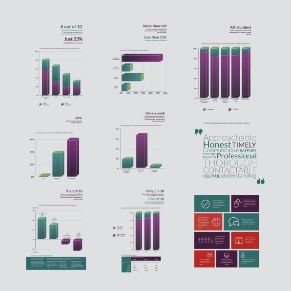
Data showed on average 38% of sale transactions fail mainly because of a lack of clarity, transparency, and communication.
The sector is falling behind in terms of customer service and the use of technology to provide timely information, updates, and helpful resources to reassure customers.
Customer insight
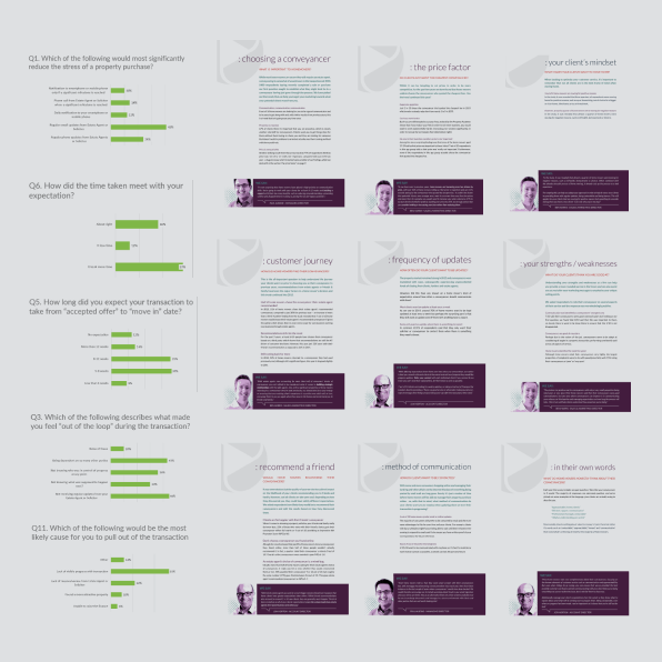
70% of home movers would like to be updated by their conveyancer at least once a week, even if there is nothing new to report.
They need sight of the ‘Chain’ they are in (Dependencies on other transactions to go through from the buyers and sellers)
Timely, and personalised, progress updates and increased handholding will increase certainty and educational content to inform clients of what happens next and who is responsible for each step.
Experience vision
Create a platform to connect buyers and sellers with their sales progression agents to share information frequently and securely.
The platform should provide the user with timely messages, to-do lists, and resources to keep them in the know, reduce anxiety, and ensure a smooth process.
Encourage collaboration and transparency and make the experience more efficient, less stressful, and enjoyable.
2.0-Definition & vision
Help is just a tap away. This was our guiding principle.
Our design principles were simple, intuitive, and fun.
We wanted to design a platform to help users navigate the complex world of property transactions. A tool that quickly connects customers to their agents and provides the user with timely, step-by-step, information, to-do lists, and resources to help them complete their tasks.


3.0-Design approach & testing
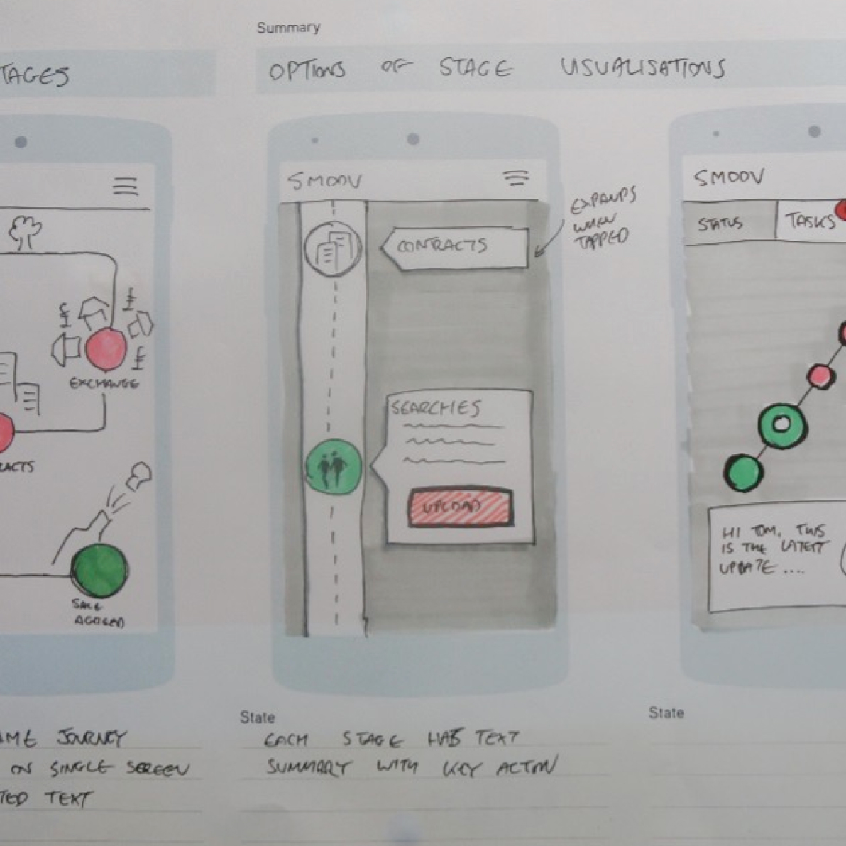
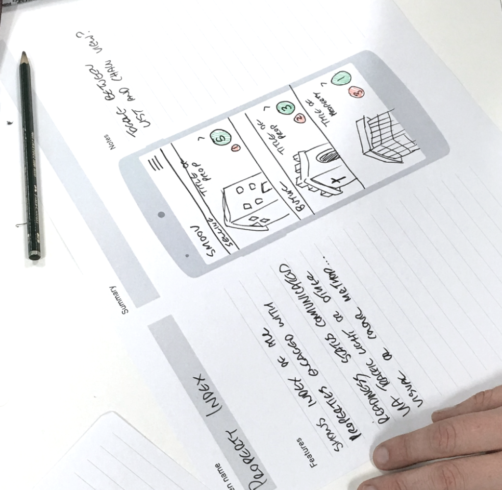
After deciding on the features, we believed were most useful to the end user, we quickly moved into wireframing key journeys ready to be turned into low-fidelity prototypes ready for testing.
The prototype was put in front of users to validate the features and functionalities of the product. Based on user feedback we went through a series of iterations to improve and further develop the product.
At the same time, we were establishing a brand identity and look and feel.

4.0-Final outcome
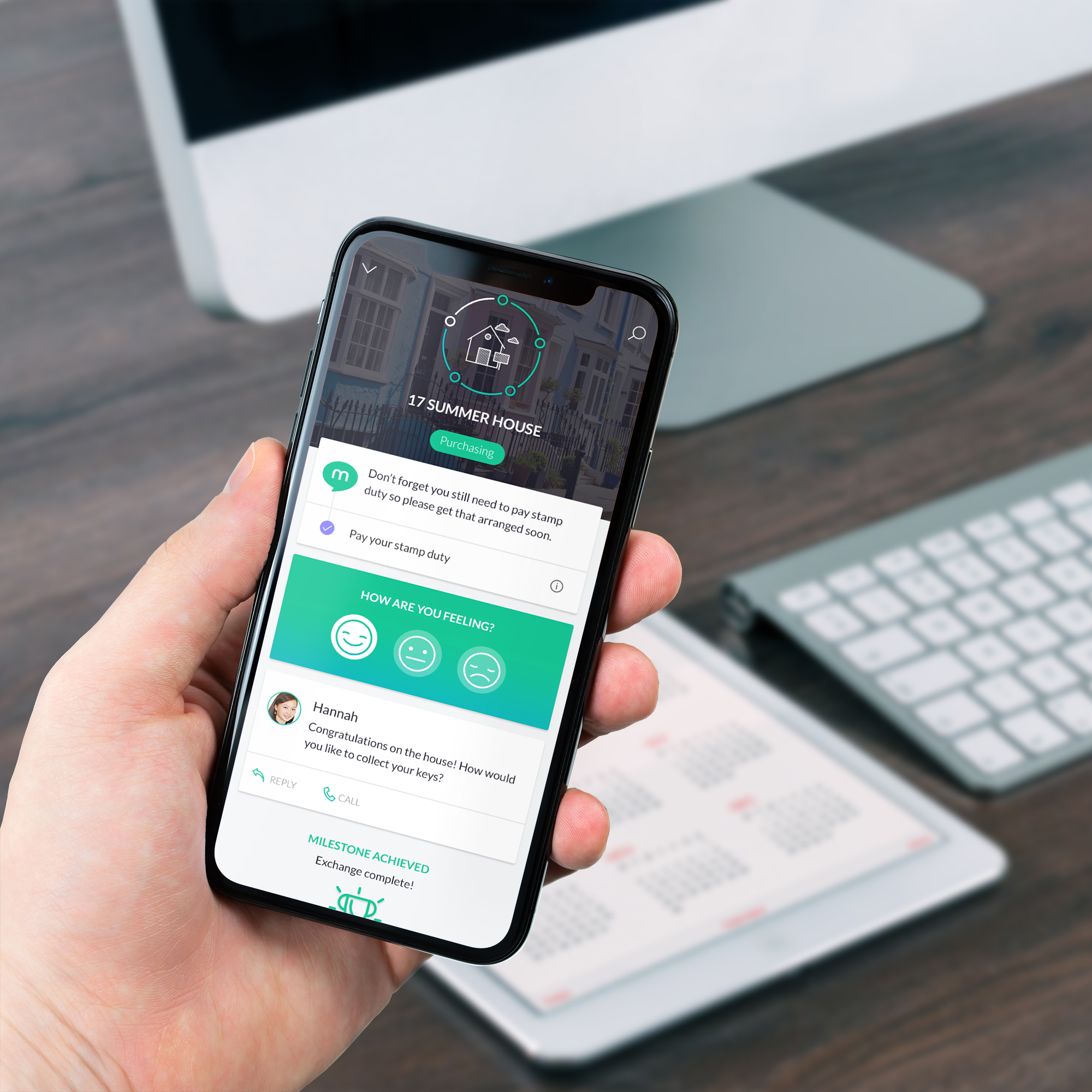
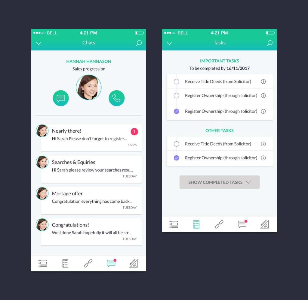
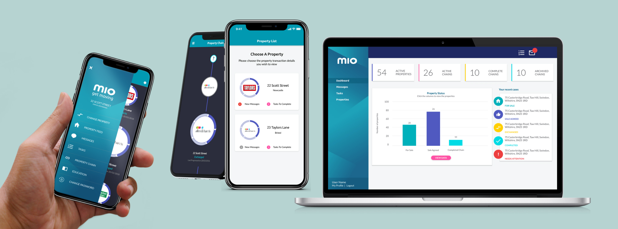
The final app is a messaging tool connecting buyers and sellers with their estate agents to share information and updates.
The process is simplified by offering users tools, resources, and to-do lists to help them understand the process and help them navigate what they must complete in order to smoothly progress through the process.
5.0 Live App and Agent Dashboard
Results
After a successful Pilot trial, the app's adoption is now increasing. Below are the latest statistics and user verbatims.
-1 week
taken off average transaction time.
35%
Of users on mio now receive daily milestone updates.
1000 firms
1000 agency firms are now using mio to communicate with clients.
Quote
“I can immediately see the important things and what to do next”.
Quote
“This is very personal and it makes me feel in control of things”.