English Heritage
PROJECT
Digital strategy
Website
Events and venues
E-commerce
ROLE
Experience
Product Design Lead
URL
AWARDS
UXUK Award
Best in Entertainment
& Leisure Experience
English Heritage was established by the National Heritage Act in 1983 as the Government’s statutory adviser on the historic environment and guardian of the National Heritage Collection of 420 historic sites.
Background
In 2013, the Government announced that it would work with English Heritage to consult on establishing a charity to care for the historic properties in the National Heritage Collection on a self-financing basis, therefore pushing the organisation to be more self-sufficient.
The business plan for the charity included significant growth in admissions and membership income with additional targets around commercial activities such as venue bookings, events, and activities.
Role & approach
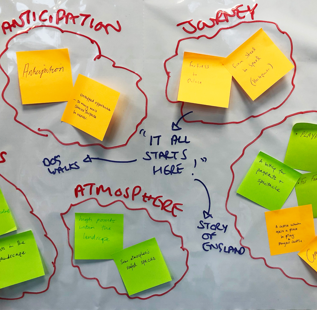
My work fell largely into two parts:
1- Engage and manage key stakeholders including heads of digital, marketing, and brand, as well as content teams, site managers, and technical engineers.
2- Assemble and lead, a team of strategists, UX, UI designers, and content creators and guide them through the process to delivery. I enjoyed being quite hands-on too.
My approach was little and often. Work closely with stakeholders, bring them on the journey, and avoid surprises.
1.0 Requirments gathering
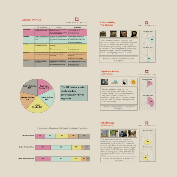
We took a user-first design approach. The research helped us identify the user cohorts who are experience seekers, culture seekers, and families, and their mindsets behind visiting the website and the emotional connections the user builds with the brand, content, and history.
Business ninsight
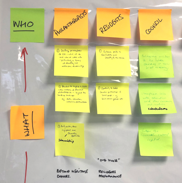
The organisation needed a site to project confidence, value, and relevance, promoting the cultural value by improving key content t and drive traffic and conversions to meet financial targets.
Customer insight
Each cohort had specific requirements, based on time, location, and situation, that needed to be considered in the design of the site and how content is served.
Experience vision
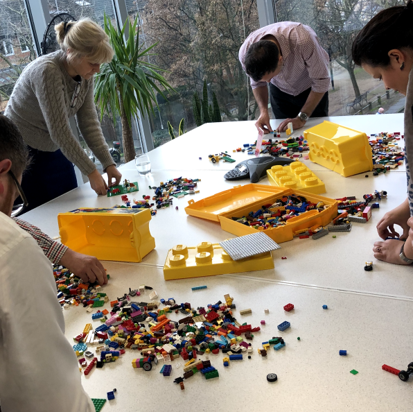
Create a website that gives the user a sense of pride, time, place, and wonder. and allow them to step into England's story.
2.0 Definition & vision
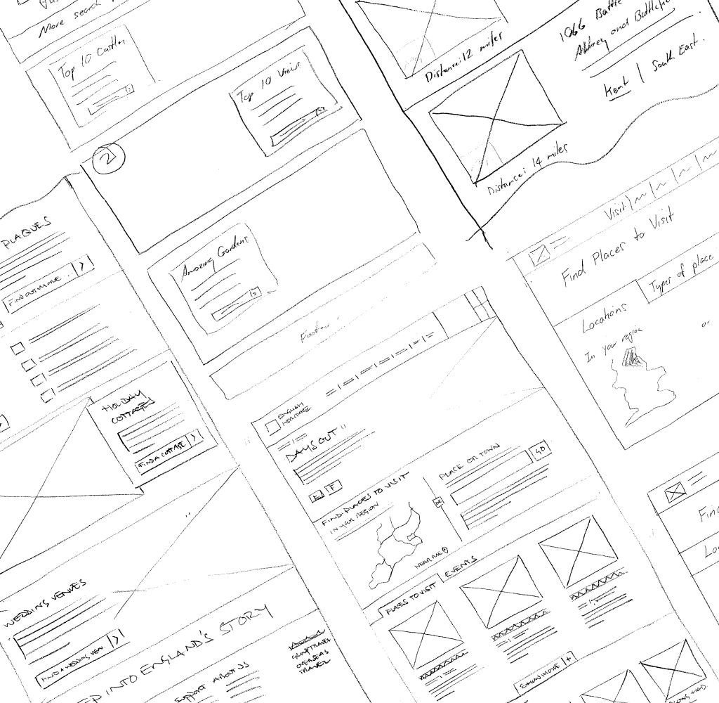
While attitudinal segments led the content design, user journeys, site structure, and IA were mapped against the three cohorts’ needs.
Through ideation sessions, concepts, and user testing, both qualitative and quantitative, we defined a set of design principles that were Simple, Relevant, and Timely, to frame our thinking moving forward.

3.0 Design execution
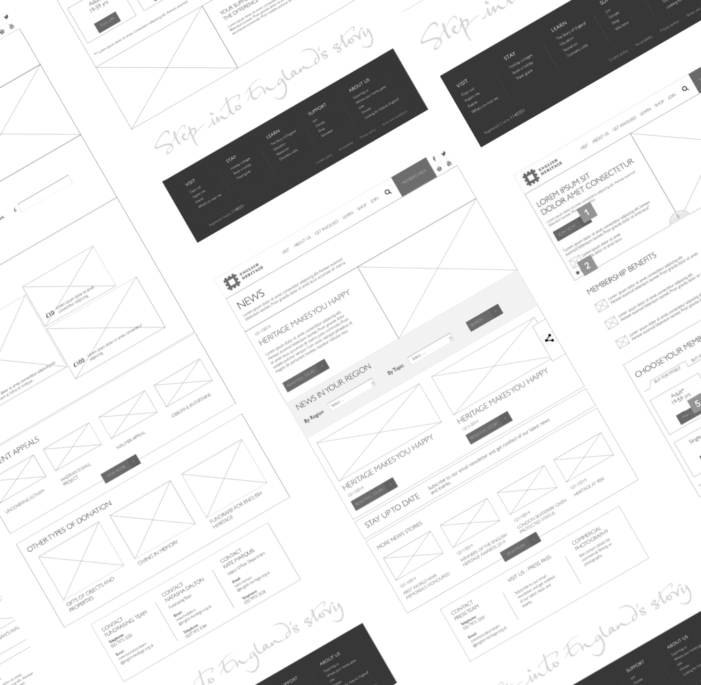
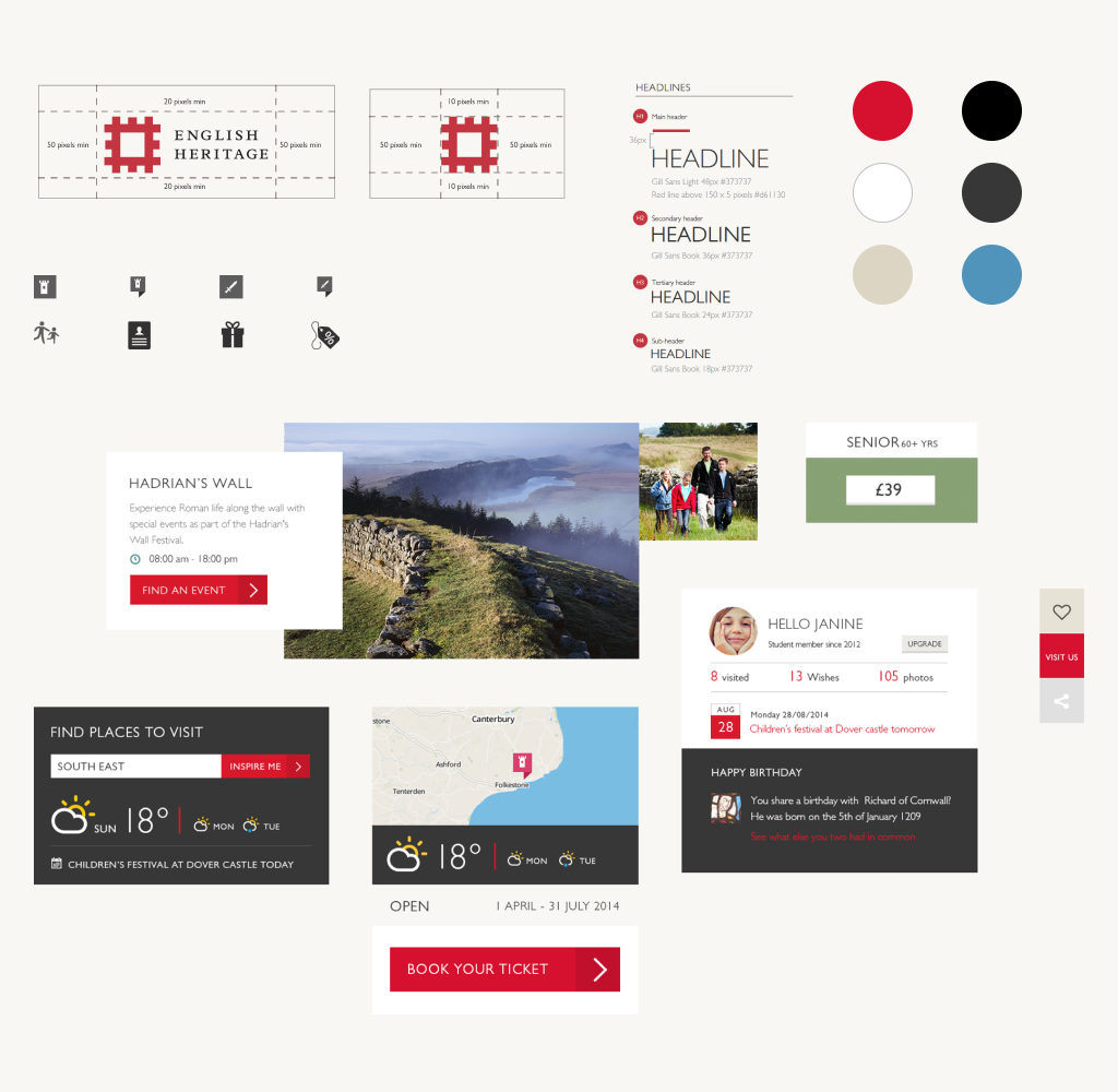
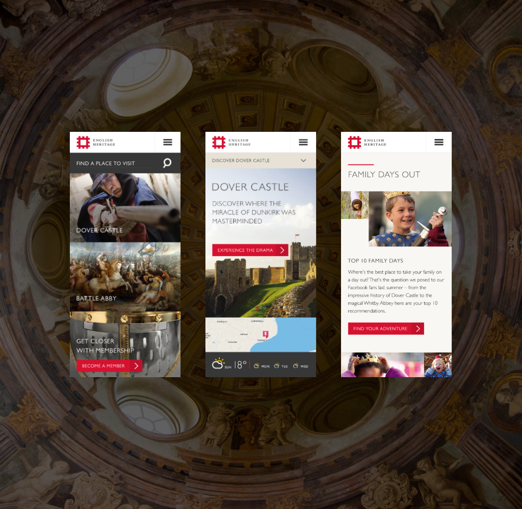
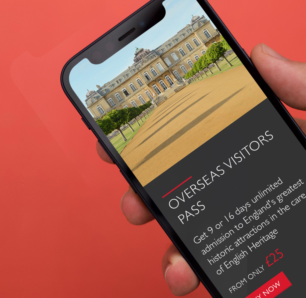
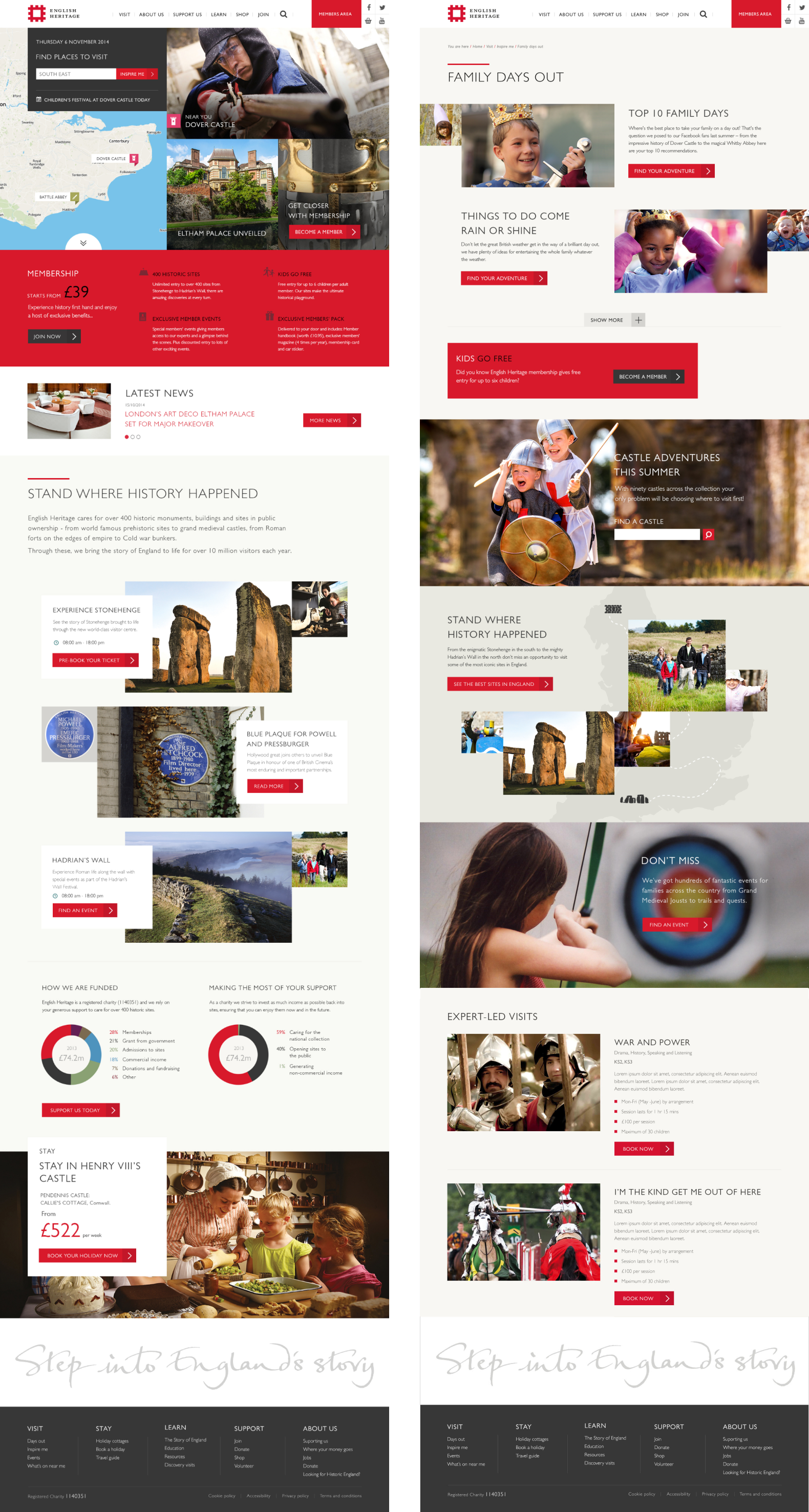
We established a mobile-first, modular design system to be applied across all platforms to ensure consistency of experience.
The system made it easy for content creators to serve up seasonal and timely content across the entire ecosystem including the main website, promoting membership as well as eCommerce and venue booking systems.
Results
The results below are data collected in the year after the transformation and launching of the site and compared to the previous year's results.
+500%
increase in event tickets transactions on tablet and mobile.
+60%
increase in unique ecommerce transactions on tablet and mobile.
+20%
longer spent on key visitor pages.
+200%
increase in organic search traffic from mobile.
-22%
decrease in clicks to conversion for property visit journey.
WHAT DID THE CLIENT SAY?
We were immediately impressed by Kardo who, as Design Lead, combined deep research, infectious enthusiasm, and the kindest constructive challenge. This result was a fantastic creative partnership with one of the best examples of collaborative working I’ve experienced.
Tamsin Burwell
Head of digital at English Heritage